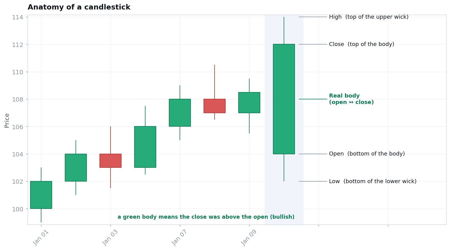
A price chart plots price (up the side) against time (across the bottom) — a picture of the auction between buyers and sellers. There are three common ways to draw it, and the candlestick is the one you'll use most.
Line chart
Connects each period's closing price into one line. Simple and clear, but it hides everything except the close.
OHLC bar
A vertical bar showing the period's range, with a left tick for the open and a right tick for the close — four prices in one mark.
Candlestick
The same four prices, drawn so the open-to-close relationship pops: a thick body plus thin wicks. Green/hollow = close above open; red/filled = close below.
Timeframes: one market, many charts
Every candle represents a slice of time you choose — a minute, an hour, a day, a week — and the same market tells a different true story at each zoom level. A stock can be rising on the weekly chart while falling on the hourly, with no contradiction: the tide comes in while individual waves retreat. The first habit of chart literacy is stating your timeframe before you read: "on the daily chart, this has been rising for three months" is a checkable sentence; "it's going up" is not. By convention, traders treat the higher timeframe as context and the lower as detail — a discipline formalized in multi-timeframe methods like Elder's Triple Screen.
Scale: linear vs. logarithmic
On long histories, check the price axis. A linear scale gives every dollar the same vertical space, so recent prices visually dwarf the past for no informational reason. A logarithmic scale gives every percentage the same space — a move from 10 to 20 looks identical to 100 to 200, because to an investor they are identical. Most serious long-term charting is done on log scale; most intraday work on linear. A chart that looks like a vertical explosion on one scale is often a modest, orderly trend on the other — always check before concluding anything dramatic.
Reading the story: structure, levels, participation
Once the anatomy is familiar, reading a chart is three questions asked in order. Structure: strip the chart to its swing highs and lows — higher highs and higher lows mean uptrend, lower of each means downtrend, neither means range (the full grammar is at trends & market structure). Levels: find the few prices where the market has repeatedly fought or reacted violently — support and resistance — and note where price sits relative to them. Participation: check volume on the bars that claim to matter; a breakout on quiet volume and one on triple the average are different events wearing the same candle. Single candles only become meaningful at a level, within a structure, with a crowd — context is most of the meaning.
What a chart can and can't tell you
A chart is a record of every agreement real buyers and sellers actually made — the most honest document in trading. It describes; it does not promise. Whether past price behavior predicts future behavior is a live academic debate (see market efficiency vs. momentum), and this site's stance is the honest middle: some regularities are real, none are reliable, and every pattern must be tested rather than trusted. Literacy comes first either way — you can't test what you can't describe.
See also
- GLOSSARYcandlestick, wick
- TRADERMunehisa Homma — the origin of candlestick thinking.
- CONCEPTCandlestick patterns, trends & market structure, support & resistance, volume, gaps — the five pillars this page opens.
- COURSEReading the Chart: Price Literacy — the free six-module guided version, ending in a full "read a chart cold" routine.
- COURSEMasterclass: "Reading a Chart"
Watch — candlesticks taught by a pro desk
Reputable, free explainers — educational, not an endorsement.

Sources (free / verified)
1. The standard textbook treatment: John Murphy, Technical Analysis of the Financial Markets (NYIF, 1999) — free breakdown: book page. 2. The guided version of this page: the free Reading the Chart course (6 modules).