A price chart plots price (up the side) against time (across the bottom) — a picture of the auction between buyers and sellers. There are three common ways to draw it, and the candlestick is the one you'll use most.
Line chart
Connects each period's closing price into one line. Simple and clear, but it hides everything except the close.
OHLC bar
A vertical bar showing the period's range, with a left tick for the open and a right tick for the close — four prices in one mark.
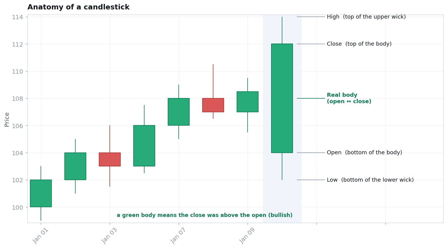
Candlestick
The same four prices, drawn so the open-to-close relationship pops: a thick body plus thin wicks. Green/hollow = close above open; red/filled = close below.
See also
- GLOSSARYcandlestick, wick
- TRADERMunehisa Homma — the origin of candlestick thinking.
- COURSEMasterclass: "Reading a Chart"
Watch — candlesticks taught by a pro desk
Reputable, free explainers — educational, not an endorsement.
